From courtrooms to classrooms: language support where it matters most.
I increased site traffic by 22% and conversions by 10% with a rebrand and design overhaul

My Role
UI/UX Designer
The Team
1 Project manager
1 Marketing specialist
2 Language specialists
2 Stakeholders
Skills + Tools Used
UI, UX, User research, Figma, Wix, Google Forms
Process
Research → Audit → Data → Branding → Web design → Launch
Timeline
1 years
Problem
Company research indicated the front page of their website needed a significant redesign.
Goal
Redesign and brand website, increase user trust, and cultivate new conversions.
The Landscape of language
While the page wasn’t in an entirely broken state it needed a lot of love in order to streamline and refine assets, as well as to utilizing a less confusing layout.
Initial asesment
-
No specific branding
-
Homepage is confusing, cluttered
-
Inconsistent informational hierarchy
-
Dated design style
-
Needs a more modern touch

Stakeholder A
"We did the best we could, but I'm not a tech-y person."
Stakeholder B
"I have some colors I'd like to use! Wait, what's WCAG?"
To keep from project bloat, as well as reducing scope creep, I narrowed everything down to an MVP.
Adjust poor color contrast
Utilize WCAG to meet accessibility standards
Do away with non-functioning logo
Establish a consistent brand and visual identity
Draw users towards featured services
Ensure users understand company services
(Wire)Framing words
After an in-depth brainstorming session with the team, as well as paper prototypes, I started addressing the layout of the page directly with several goals:
-
Reduce visual clutter
-
Allow for more accessible sections
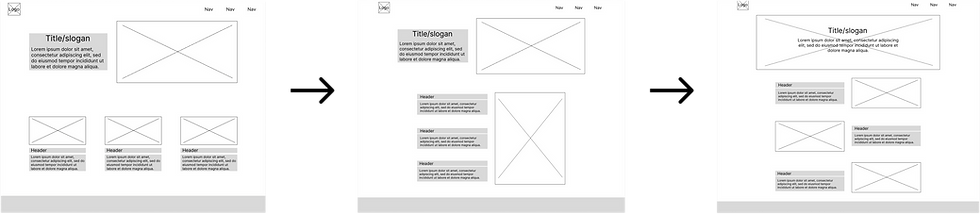
After a round of feedback the third option showed the greatest ease of use with users.
Too busy
Lacks variation
Well balanced
Don't forget the system
I developed a small design system for the site, as well as for any marketing material going forward.
Blue in three shades - Cool, calming, trustworthy
Noto Sans - Easily legible in english as well as Spanish
Stakeholder B
"Wasn't what I had in mind but I like it. "

Hi-fi Mockup
Combining all the elements together yielded a succinct, clean, design to be presented to the team and to stakeholders.
Highlights
-
Significantly streamlined
-
Easily identifiable CTAs
-
Consistent visual hierarchy
-
Simple contact section
-
Unified color and type choices

But wait, there's more
During the presentation for the redesign the company presented several new services that they would like to be featured on the site.
A hurdle to reevaluate, challenge accepted.
It did change the overall direction as the team indicated that they wanted to remove old services entirely while focusing their efforts on the newer services.
The, somewhat nervous, marketing lead
"We know you just finished, but we've brainstormed some new services. Can we implement them into the design?"
The team requested a section that included the three new services as points of interest
Passport photo/notary services
Information for group drivers education classes
Curated study material availability
"This will be our low-lift service, and allows us to work with people who aren't clients, but need the service. "
“We're going to utilize a local space for group drivers ed classes, we can help more people faster.”
“The curated list is ready! The materials will help our clients study at home.”
Wireframe Pt. Dos
After a round of user testing with the team, and outside sources, data concluded that the second option was most effective.
“Not enough variation for new content”

“Each card is succinct and compact”

Deliverable; survey says!
Breakdown
-
Reduces clutter
-
Increases accessibility
-
Clear hierarchy
-
Clean and neat
-
Concise service descriptions
The much less nervous marketing lead
"This is what I was hoping for!"

Design overhaul results
+22%
Increase in site traffic
+10%
Increase in conversions
What did you learn in class?
Adaptability is the lesson; Changes always come.
In all things you must remain flexible. While the design process went smoothly for the most part, the inevitability of life is that things will always change. New information is discovered, directions are adjusted, and in the case of ITW new features/products are added to the arsenal and need to be accounted for in the process.
Luckily the time resource was abundant so I was able to make adjustments without immediate risk to my work sanity. But maintaining a pipeline that's ahead of schedule and requesting more time than might be needed can compensate for the risk of diversion. "Under estimate and over perform."
How else would you phrase the work?
Marketing and partnership exploration.
The majority of the marketing for the business was word of mouth, and through the site, so I would've liked to explore more content rich avenues. I think leaning more into things like boosting google ads, and possibly partnerships with other not-for-profits/legal offices, could have been fruitful. Also, I had physical marketing materials I would've loved to produce!
Want to build together?
Fire away an email to: harrisonklostreich@gmail.com